SaaS Dashboards & Visualizations: Unlocking the Power of Data
- Written by Chrissy Kapralos
- Published onJan 11, 2025
Table of Contents
SaaS dashboards don’t just tell you how your SaaS business is performing — they show you. These accessible data visualizations give brands insights into revenue and growth for their SaaS products.
Grow Slash is a platform that provides SaaS companies like yours with real-time performance insights through visually appealing data visualizations and dashboards.
In this guide, we’ll cover different types of SaaS dashboards, how they impact growth, and how to use dashboards to grow your business’s revenue.
What are SaaS Dashboards?
SaaS dashboards give you actionable business insights by tracking, analyzing, and optimizing subscription-specific metrics.
They monitor your business’s performance and automate lengthy calculations to tell you how you’re performing through revenue and customer metrics like monthly recurring revenue (MRR), annual recurring revenue (ARR), and more.
Think about all the ways SaaS businesses have to assess success in their business.
They have many potential data points to analyze when reviewing performance, but it's nearly impossible to recognize a performance shift when looking at data alone.
A SaaS brand might experience an influx of subscribers one month, contrasted with a dip in monthly recurring revenue another month. It's a SaaS dashboard that will highlight that deviation in performance in a visually accessible way. Line graphs, metric highlights, and historical charts communicate performance more effectively.
In other words? SaaS dashboards inform businesses of performance shifts and trends immediately through visual data representations.
Other features of SaaS dashboards
Performance data analysis and representation are the most prominent features of a SaaS dashboard. But here are a few more things you can do with them:
- Collaboration: Toggle user permissions and sharing functionalities to communicate dashboard insights or share filtered snapshots with other members of your team.
- Exporting: Transfer data from a dashboard into an Excel sheet to analyze it in the context of other business operations.
- Multi-device sharing: Share information with other team members, or access the same dashboard views from multiple devices
But is the importance of SaaS analytics dashboards relevant for any SaaS business? Yes — and here’s why.
1.2 Why SaaS Dashboards Are Essential
If you’re a SaaS business in the US, we have good news and bad news. The good news is that the US has the largest SaaS business market — by 2027, US SaaS brands are expected to bring in $377 billion in revenue.
The bad news? With all that revenue potential comes a ton of competition.
And you can’t keep up with that competition without immediate, data-backed insights on your performance.
SaaS dashboards display actionable insights that help you:
- Optimize growth metrics: If you link business events to performance dips, you can avoid those actions to optimize specific metrics.
- Enhance decision-making across teams: SaaS dashboards act as evidence to back up a business strategy with the goal of more revenue, subscribers, or other desired outcomes.
- Identify revenue-generating opportunities: You can identify key points in your business history that brought you revenue through SaaS dashboards.
But how are SaaS dashboards different from other analytics dashboards?
2. SaaS Dashboards vs. General Dashboard Tools
SaaS analytics dashboards are distinct from general dashboard tools. Why? Because SaaS businesses are unique in their product, sales cycle, customers, and relevant metrics. And SaaS dashboards account for those differences in its method of tracking and visualization.
Most SaaS brands are subscription businesses, so performance is tracked differently than an ecommerce brand or other kind of business.
2.1 SaaS Dashboards: Comparison with General Dashboards
Here's how SaaS dashboards stack up against general dashboards:
- Pre-Built Templates: SaaS dashboards have templates for specific SaaS growth trajectories and sales cycles. They monitor lead-to-subscribe time, subscriber growth, the customer journey, and more.
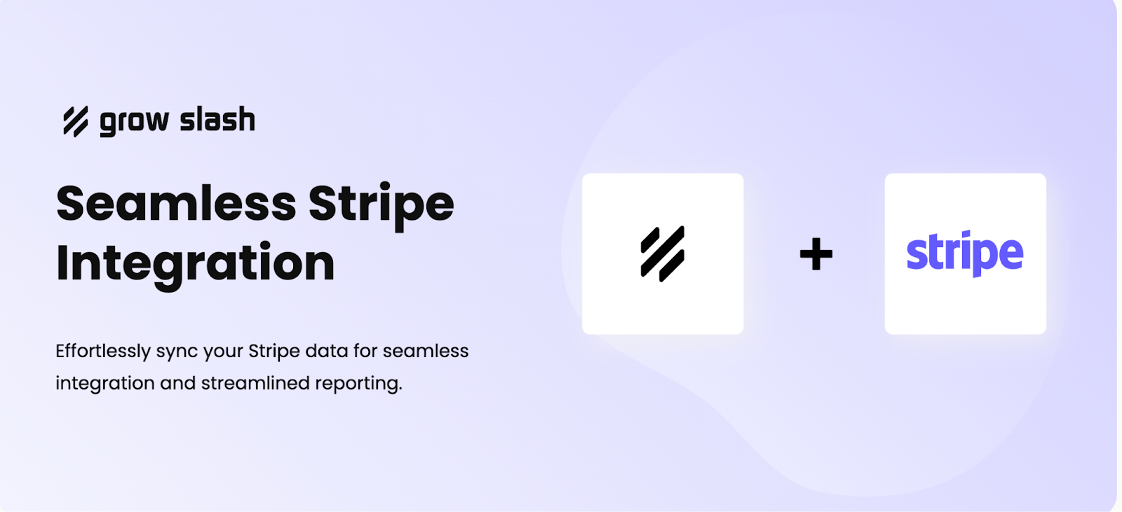
- Integration with relevant software: SaaS brands might use other software tools specific to their business type. For example, they might use payment software like Stripe or customer relationship management software (CRM) like Salesforce. SaaS dashboards often have integrations with other types of software to seamlessly transfer and track data.
- Automated SaaS metric calculations: MRR and ARR look like simple numbers on our SaaS dashboard screen. But behind the scenes, our AI technology takes all the revenue and subscriber data from your business and automatically calculates these vital metrics with minimal errors.
- Efficiency: Niche specificity helps you save time in your strategy process. If a SaaS business used a general dashboard, they would have to manually input SaaS-specific data and calculate desired metrics on their own. SaaS analytics dashboards are equipped with the tech to generate SaaS metrics and insights for you.
3. SaaS Metrics Dashboards vs. SaaS KPIs Dashboards
Metrics and KPIs (key performance indicators) are often used interchangeably, but that’s an error. Think of metrics as ingredients, while KPIs are the essential steps to a recipe.
Metrics are quantifiable data points that track broad aspects of performance and help you identify issues quickly.
For example, MRR is a metric that tracks how much monthly recurring revenue you generate from your business. A dip in MRR tells you that something caused some of your subscribers to either downgrade their subscription or cancel them altogether.
Or, a marketing team could track customer acquisition cost over time to find more efficiencies in their pay-per-click (PPC) campaigns.
KPIs, on the other hand, align high-level business metrics to specific, strategic business goals. For example, a KPI might look like:
Improve MRR by 50% in the next 3 months.
SaaS metrics dashboards help you broadly monitor performance across revenue, marketing, customer, and product departments in your SaaS business. KPI dashboards help you translate metrics into more strategic goals to work toward.
Grow Slash’s dashboards let you track metrics and their relation to adjustable KPIs. Our AI recommendation engine will look at your business performance data and help you identify which metrics and KPIs are most pertinent to your performance.
4. Best Practices for Designing SaaS Dashboards
SaaS dashboards aren’t one-size-fits-all for every SaaS business. While you can pick from similar metrics, the ones most meaningful to your business’s growth might differ from another SaaS company’s.
That’s why Grow Slash lets you customize SaaS dashboard design. So, how do you get started?
We recommend these effective dashboard practices for your SaaS business:
4.1 Pick the right visualization
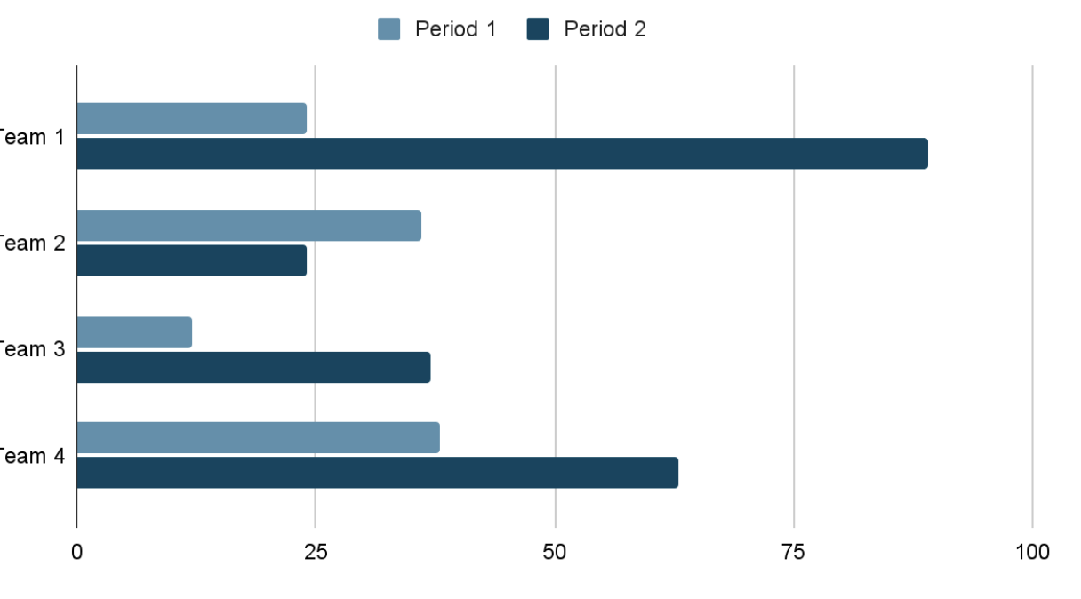
You can display data in a few different ways. Bar charts are ideal if you want to compare two data points against each other. For example, you could use a bar chart to compare your number of subscribers before and after implementing a new feature each year.
Line charts are more effective for communicating trends over time. You might use them to highlight historical performance, like monthly recurring revenue (MRR) over the course of ten years, or 12 months within the year.
4.2 Simplify layouts
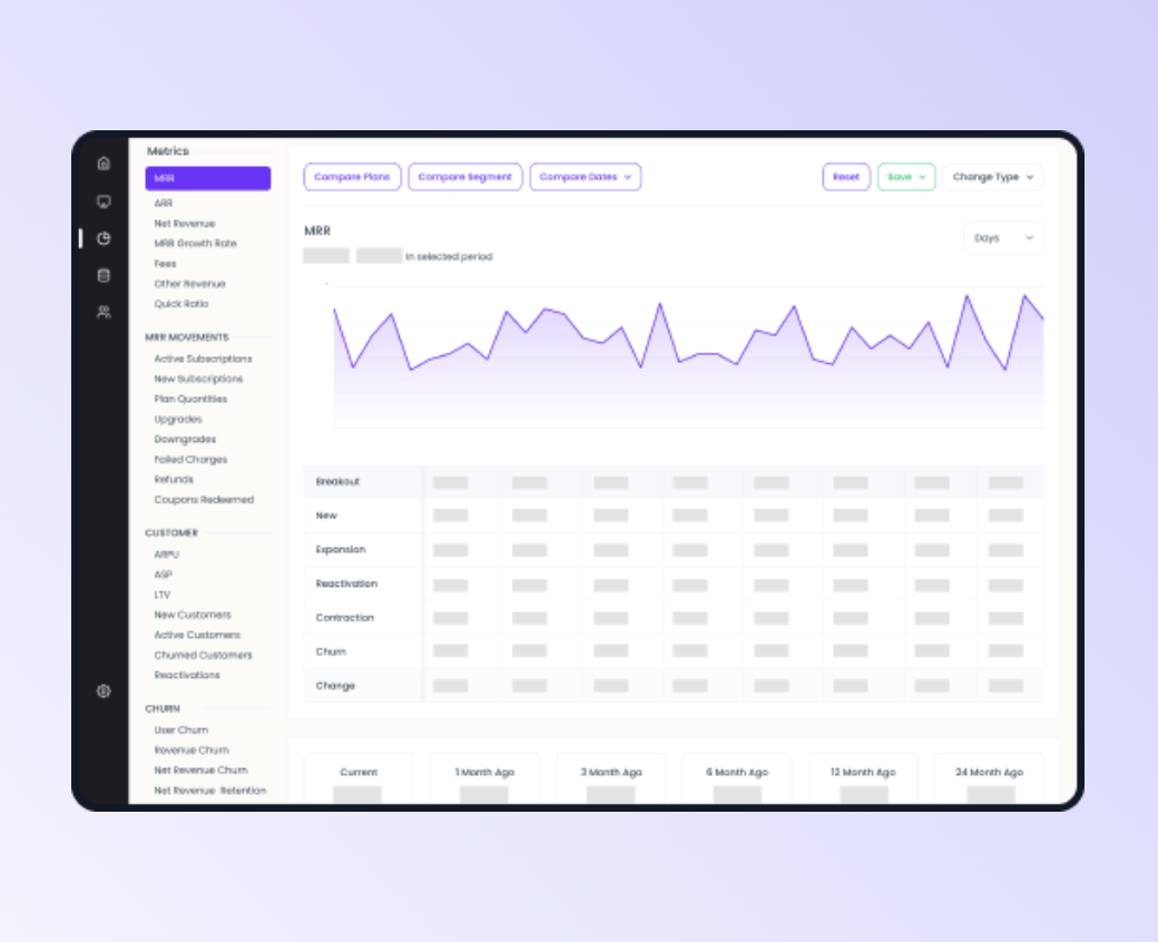
SaaS brands have many metrics available to assess performance, but that doesn’t mean they should all show up in one dashboard. A best practice is to take away 1-3 actionable insights from each dashboard view. That’s why Grow Slash only displays a select number of metrics within each view.
Of course, you could toggle and filter to switch metrics and expand your analysis. But it’s best to look at fewer variables to enhance accuracy when linking certain causes or actions to performance patterns.
Ensure device compatibility
SaaS dashboards might look awesome on a desktop computer, but wonky on a mobile device. Our job as SaaS growth experts is to make your business data as accessible as possible, including for mobile, tablet, and computer screens from multiple operating systems.

4.3 Enable interactivity
Nobody likes to feel ignored, right? That’s why you respond in conversations with people — and why your product team prioritized interactivity in your SaaS demo. But interactivity is a universal user experience necessity, including for SaaS dashboards that your team works with.
SaaS dashboard interactivity means you can toggle its filters and views to display the data you want, how you want. Our filters help you drill down specific metrics, timelines, business actions, or product features in relation to your performance.
Segmentation is also vital to give you multiple angles of your performance. Your dashboards should respond to your team’s questions with segmented data, like specific metrics from a particular type of customer base, or revenue deets before and after feature launches.
4.4 Regularly adapt dashboards to business needs
SaaS brands evolve with customer trends, competition, and industry changes in general. Dashboards should evolve with them to display the most relevant insights for growth.
This might look like:
- Including new metrics from team feedback or industry trends
- Adding competitive analysis to account for new industry players and updates
- Expanding data capacity to bigger subscriber bases if your SaaS company grows
Here’s an example. A SaaS brand might expand their marketing reach to target a younger demographic. But that younger demographic might have different usage patterns or pay more for certain features.
In this case, we’d recommend expanding dashboard views and analysis to look at product feature adoption rates and frequency, and compare those metrics across different historical periods and customer types.
5. Types of SaaS Dashboards by Use Case
Did you know that you can generate hundreds of unique dashboard views with Grow Slash? Our flexibility helps us deliver the most specific and relevant business insights to our SaaS clients.
Still, with all the segments and filters, SaaS dashboards tend to fall under four popular use cases.
You can use four types of SaaS dashboards to assess different aspects of your business’s performance:
5.1 Revenue Dashboard
This dashboard view shows you everything related to your SaaS business’s money — how much you generate, where it comes from, and when you lose it, too. Revenue dashboards communicate your SaaS company’s financial health and subscription growth through metrics like:
- Customer churn: This tells you what percentage of your customers eventually cancel their subscription to your product. A modified CC metric might also indicate when customers downgrade to a lower, less expensive pricing tier for your product.
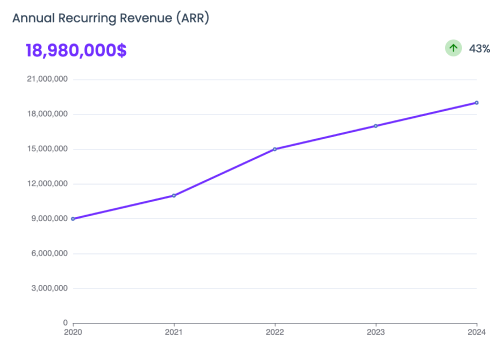
- MRR: Monthly recurring revenue predicts how much revenue your company generates each month.
- ARR: Annual recurring revenue predicts how much revenue your company generates each year. Your actual annual revenue might not always correspond to a neat, 12X (MRR); however, that indicates changes in your subscriber behavior over time.
- Payment provider fees: The total amount of fees incurred by a SaaS business, including processing and conversion fees from payment processors like Stripe.
- Net cash flow: The total amount of money brought into your business, which includes subscribers fees from monthly and quarterly plans. Net cash flow also considers subtracted costs for refunds and processing fees.
- SaaS quick ratio: Quick yes or no view of whether a SaaS brand is expanding or shrinking. It measures a SaaS business’ growth efficiency by comparing recurring to lost revenue.
But even these core revenue metrics won’t always give you a complete picture of your revenue. That’s why it’s important to factor in insights from ARR and MRR variables like:
- New business MRR or ARR: Monthly or annual revenue from new subscribers
- Expansion MRR or ARR: Monthly or annual recurring revenue from existing subscribers who upgrade to a more expensive plan
- Churn MRR or ARR: Monthly or annual recurring revenue lost from customer churn (customers who cancel their subscriptions)
At Grow Slash, revenue dashboards are our bread and butter. We see them as the most important dashboard to assess performance, especially when relating revenue changes to causes like:
- Downgrades: Subscribers who switch from a higher pricing tier to a less expensive or basic tier.
- Upgrades: Subscribers who switch from a basic tier to a higher, more expensive tier.
- Cancellations: Subscribers who cancel their plan with your product and stop using it.
- Reactivations: Subscribers who reactivate their account after having previously canceled it.
Revenue dashboards also allow you to visualize comparisons for sources of revenue. For example, you could contrast how much of your company’s revenue comes from new subscribers versus upgraded ones. Insights from this comparison might indicate a successful new feature, for example.
5.2 Customer Success Dashboard
Sure, your MRR and ARR might show the money rolling in. But over time, ask yourself:
How do your customers actually feel about your product? The way they feel will actually dictate revenue down the line. If they aren't happy with your product or service, you might not be able to rely on their loyalty.
More specifically, how many of them stick around for longer than three months? By the way, three months is the average time that one-third of customers take before cancelling a subscription.
Your customer success dashboard tells this story with metrics like:
- Retention rate: How many of your customers continue to subscribe to your product over a set period of time
- Net promoter score (NPS): How likely (from 1-10) your customers are to recommend your SaaS product
- Churn prediction: How likely your customers are to end their subscriptions to your product
When you learn about and prioritize customer satisfaction, you protect both your business’s reputation and revenue. Think about it: You might grow your SaaS product and gain 5 new subscribers a week. But if you lose 4 or 5 each week as well, your churn essentially renders your marketing campaigns useless.
Customer success dashboards help you prevent customer churn and even understand your customers better.
5.3 Marketing Dashboard
SaaS companies can spend up to 50% of their revenue on marketing. If they bring in new subscribers (ideally ones with a high customer lifetime value), then the money’s well spent.
But if you spend 50% of your revenue and don’t see a return on it? Your SaaS product is in trouble.
You can avoid a loss like that with insights from a SaaS marketing dashboard. Here are some metrics you could see on one:
- CAC: Customer acquisition cost (also a revenue dashboard metric mentioned above)
- ROI: Return on investment, which calculates the revenue generated compared to money invested into various marketing initiatives
- Lead conversion rates: How much of your audience who displays interest in your product actually convert into a paying customer
Insights from a marketing dashboard help you identify which marketing campaigns drain your budget and prioritize ones that deliver conversions and customers.
5.4 Product Dashboard
Let’s dive into your actual SaaS product. You might offer 20+ features across various pricing tiers — but how do you know which ones cause anomalies in performance? Your product dashboard will tell you with metrics like:
- Feature adoption rate: How many subscribers used your feature compared to the ones who didn’t
- Time to adopt: How long it took on average for subscribers to adopt your new feature
- Depth of adoption: How often do your subscribers use your feature
These metrics don’t just tell you whether customers use your feature — they tell you if customers find it easy to use, effective for their needs, or difficult to understand.
Another metric — breadth of adoption — shows you how many of your features are used by your customers, and identifies ones that aren’t as popularly used.
Product dashboards help you understand gaps in your product, enhance new features, and retain your customers.
6. Emerging Trends in SaaS Dashboards
The future of SaaS visualization lies in these five trends:
6.1 AI-powered dashboards
About 35% of SaaS companies use AI within their platforms. Naturally, SaaS analytics dashboards should keep up and leverage its efficiency, too.
AI and machine learning helps us deliver predictive insights to brands about their performance. With AI technology, a dashboard can provide valuable insights about future business revenue, subscriber trends, and other metrics.
Grow Slash uses AI-powered recommendations for personalization, too. It helps us provide the most relevant metrics to a specific SaaS brand based on their customer, revenue, and sales data. The AI engine might highlight MRR as a more relevant driver for growth than the number of subscribers, for example.
6.2 Personalization to user roles and objectives
Let’s say you recently launched a new feature in your SaaS product last week. You promoted that feature on social media and noticed an uptick in MRR on your SaaS dashboard.
Wonderful — but where and when did the revenue come from exactly? The best SaaS metrics dashboards help you pinpoint those answers as specifically as possible. Here’s the thing: not every SaaS brand grows in the same way.
That’s why your SaaS metrics dashboards should allow for personalization based on what’s important to your brand.
Personalized filters might include:
- Event-specific insights
- Real-time data collection for daily, weekly, and monthly performance tracking
- Revenue from new subscribers compared to upsold or upgraded existing subscribers
Another way to personalize your SaaS dashboards? User permissions.
The SaaS startup space booms with potential investors from venture capital firms and other avenues. But they won’t spend a dime if they’re uncertain of your revenue and performance.
The best way to convince someone your business is successful? Lay it out for them on a dashboard —- but they shouldn’t be privy to every single aspect of your business’s performance. You might want to show them specific dashboard views, while keeping others only accessible to internal team members via personalized user roles and permissions.
6.3 Mobile-first dashboards for remote accessibility
Mobile devices make up nearly 60% of web traffic in 2024 — and from historical trends, that proportion will keep increasing. Pair that with a rise in remote and hybrid work, and it’s likely everyone will use their phones to work at least once during the day.
As for our busy SaaS leads? We know you’re on the go and will likely peep performance dashboards on your smartphones or tablets. Mobile-first dashboards look like:
- Optimized layouts: Dashboards adjust to each device to display relevant views and insights in varying frame sizes and scroll lengths.
- Load speed: Dashboards still load in under two seconds whether on desktop or mobile devices.
- Navigation: Easily spotted filter menu to allow mobile users to navigate different dashboard views
PS: Grow Slash considered all three when optimizing our SaaS dashboards for desktop, tablet, and mobile views!
6.4 Data storytelling: Integrating context with visuals
Visuals and data storytelling go hand in hand. Even medical professionals include charts and graphs in their studies to communicate important highlights for their readers.
Let’s say your SaaS brand generated between $4,000 to $8,000 in revenue from various sources each month, over the course of 24 months.
If every month brought $7,500 - $8,000 except for one, would you catch that anomaly in a body of text? Perhaps — but will the rest of your team, stakeholders, or investors? Perhaps not.
Data visualizations tell the story behind your revenue. A line graph with one small dip two years ago identifies an unusual month, but also highlights a strong track record of performance.
6.5 Real-time sharing and collaboration
The future of tech work continues to be hybrid at least, and completely remote at most. While only a small portion of companies (around 16%) are completely remote, a significant 83% see hybrid work as ideal.
This speaks to two areas of yoir SaaS products: your employees, and the companies who use your product.
Whether your SaaS brand has 5 or 500 employees, they need to feel connected to one another and understand how their individual work comes together to reach your business goals. Otherwise, they might not make data-driven decisions or feel engaged at work. The result? Gaps in your product that your customers will struggle with and potentially churn away for.
That’s why real-time analytics sharing and team collaboration are a must-have for any business process or software choice, including for SaaS dashboards. When your team is prepared and informed, your customers will benefit in the long run from a stellar product.
7. The Impact of SaaS Metrics Dashboards on Decision-Making
Did your SaaS brand experience revenue growth this past year?
If not, you wouldn’t be alone. Most SaaS brands saw their average annual revenue growth drop from 28% to 2022 to 21% in 2023. That’s been a pattern the last few quarters.
Data-driven decision making in SaaS is the best way to turn your revenue around. And SaaS metrics dashboards give you the data to do that.
Here’s how:
7.1 Real-time analytics enhance decision-making speed and accuracy
SaaS dashboards give you better visibility of your business performance. They help you identify a shift in important metrics or performance drop immediately, which helps you address issues faster.
Let’s say your number of new subscribers dips over 50% after you increase your prices. SaaS dashboards will identify that drop and visualize it for you to notice it right away. This way, your team is better prepared to make the connection between poor performance and company decisions.
7.2 Cross-departmental insights centralize data and foster collaboration
If you’re a product analyst, you might not speak the same language as the RevOps or marketing teams. But SaaS dashboards bridge those siloes and help you notice trends across your entire SaaS business.
For example, with support from SaaS dashboards, a revenue strategist might account for trends in customer success and marketing before making a tunnel-visioned decision on pricing.
Another example? A low customer acquisition cost (CAC) is a marketing metric that might look positive at first glance.
But without insights into revenue SaaS metrics like customer lifetime value (CLV), that CAC might not tell the whole story.
SaaS metrics dashboards give you visibility from every angle of performance.
CLV and CAC require nuance from both your revenue and marketing team to accurately report on your business performance.
Cross-departmental insights also come with a bonus benefit: better collaboration. Data silos are the bane of any SaaS brand’s existence and cause gaps not only in your product but also your customer experience. SaaS metrics promote better collaboration across teams to enhance your strategic decisions and product as a whole.

7.3 Specific metrics can inform departmental decisions.
A balanced look at each department helps you make more rounded and informed decisions to drive revenue.
SaaS metrics dashboards display metrics from different areas of a SaaS business, like:
- Customer acquisition cost (marketing)
- Adoption rate (product)
- MRR and ARR (revenue)
With each department privy to these metrics, they can identify and address trends to strategize initiatives in their departments.
For example, a SaaS marketing team monitors CAC trends to:
- Identify marketing campaigns with poor return on ad spend (ROAS)
- Reallocate budgets to higher-performing channels and campaigns
- Monitor which audiences are most profitable to target in marketing campaigns
7.4 Enhanced cybersecurity measures from performance monitoring
When your customers subscribe to your SaaS product, they decide to trust you with their personal information. But it only takes one security breach to ruin your SaaS brand’s reputation. In fact, 45% of tech leaders have experienced a cybersecurity incident through SaaS software this year. And almost 45% list cybersecurity as a top barrier to adopting a SaaS product.
SaaS metrics dashboards help you identify and prevent cybersecurity threats because they tell you in real-time when your product is vulnerable. Our experts at Grow Slash swear by performance monitoring as a natural compliment to any cybersecurity strategy.
Some metrics you might use SaaS dashboards to monitor for cybersecurity include:
- Annual security incidents
- Mean time to detect (MTD)
- Mean time to respond (MTR)

7.5 Business intelligence and insights:
SaaS metrics dashboards record and monitor thousands of data points across your product’s performance. But a SaaS dashboard’s true value comes from the transformation of all that data into accessible business intelligence.
It’s business intelligence that helps SaaS business owners make better decisions over time. And the best way to understand that intelligence is through visualizations. After all, Deloitte shares that most people process visual information more effectively.
Unlock SaaS Growth with Grow Slash’s Dashboards
Today’s competitive SaaS landscape forces brands to close any possible gap for revenue loss. And until you leverage the power of SaaS metrics dashboards, your product will continue to leak revenue.
SaaS dashboards empower you to monitor your business’s health, collaborate with your team, and identify revenue-generating (and losing) opportunities quickly.
Ready to transform your strategic decision-making process and unleash more revenue? Try Grow Slash’s SaaS metrics dashboards today!
Get Started with
Grow Slash
Join over 1,452+ startups already growing with our insights
Read more Blogs
Elevate your strategies with our expert advice and tips!

Dec 18, 2025
Data Analytics

Get started with Growslash